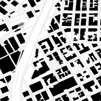
 A Map of Every Building in America
The New York Times created something surprisingly wonderful with this project.
Classic maps answer questions like: How do I get from Point A to Point B? These data images, instead, evoke questions — sometimes, simply: What’s that?
We found fascinating patterns in the arrangements of buildings. Traditional road maps highlight streets and highways; here they show up as a linear absence.
Where buildings are clustered together, in downtowns, the image is darker, dense. As suburbs stretch out with their larger lawns and malls, the map grows lighter. Your eye can follow the ways that development conforms to landscape features like water and slopes.
You can read history in the transition from curving, paved-over cow paths in old downtowns to suburban sprawl; you can detect signals of wealth and poverty, sometimes almost next door to each other. It all reveals what Andy Woodruff, a cartographer, calls “the sometimes aesthetically pleasing patterns of the built environment.”
These images don’t just reveal cityscapes; they reveal ourselves.